One of the more popular recurring items online are images where different people see different things (like that blue-or-green-dress). In your organization, your entire website might be like that. You see something clunky, outdated, hard-to-use, and that no longer represents your brand. You see a website in need of an upgrade.
But leadership? They see an expensive project.
That can be a problem. You recognize a need, but leadership only sees the cost. They see the expenses and time that go into redoing the website and aren’t sure if it is worth it. But you know that to stay competitive and relevant, you need to update your site. You need to get their buy-in.
After all, your website is the public face of your brand. It’s the first thing most people interact with. You know that redoing your site isn’t a cost…it’s an investment. Getting buy-in might be an effort, but it is worth it. Here’s how you can convince leadership that it’s worth doing and worth doing right.
The basics: Why you need a new website
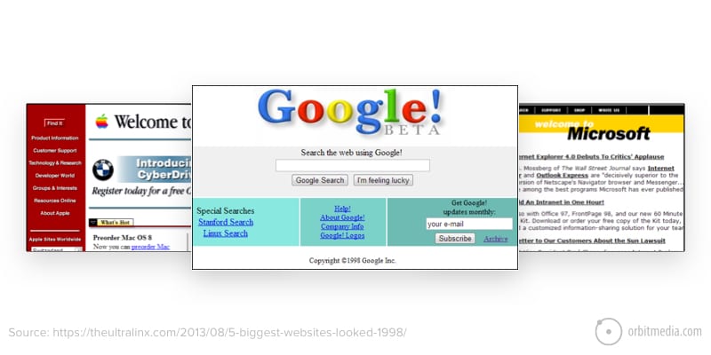
The most important thing to let your leadership know is that this is an inevitable cost. Everyone needs a new website eventually. If you don’t get one, you start to become very quickly outdated. After a few years, you might as well have the dancing baby on your home page.

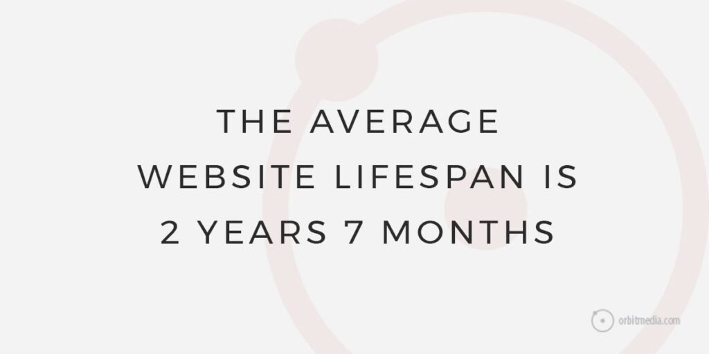
So how long should your website last? Our research shows that the average lifespan of a website is just 2 years and 7 months. Now, of course, that’s average: some last longer, some are outdated quicker. There are a couple of broad reasons why websites get outdated.

General trends
This one isn’t easy to quantify, but sometimes websites get out of date because the general trend in websites has evolved. Several years ago, the “infinite scroll” was very popular….and then it wasn’t. If you had the Infinite Scroll, you looked kind of weird. These things happen, and what is cutting-edge is suddenly out of date.
These aren’t just out of date and sort of off-kilter, like sweater-jackets from the 70s. There are a lot of things that aren’t tracked by Google analytics. Slideshows, carousels, accordion content, and some other interactions don’t give you any love from Google. That’s not a matter of aesthetics; that’s fundamentally harming a key element of your marketing.
There are other functionality issues that come into play. Changes in accessibility standards, mobile usage and responsiveness, voice search, and more change the way we make websites. This isn’t just a matter of trend — it is one of usability. If your website is no longer usable by your visitors, it creates friction and drives them away. It disinhibits business and serves as an obstacle.
Unique website issues
Beyond broad trends, there are very specific reasons why your website no longer serves your purposes. These include:
Internal usability
Are you able to update it easily? Are you able to renew the content? Can you easily put out special offers or news about events? If not, it’s like hauling a huge trailer with a compact car. You might reach your destination, but not after a lot of time, a lot of frustration, and probably a few crashes.
Visitor usability
If you want to expand what visitors can do (i.e. shop online, register for classes, book a trip), you either have to Frankenstein in some functionality or upgrade your website. The former doesn’t work very well. You end up with 100 costly, competing, and barely-compatible plug-ins. Patchwork solutions never end up saving money.
It no longer tells your story
A classic example of this is a start-up who has become established. You don’t want your homepage to feature your Foosball table. But every company updates its message, its images, and its offerings as time goes on. People come and go; ideas evolve. If your website doesn’t reflect your growth, it’s holding you back.
It no longer matches your brand
Colors change, logos change, general aesthetics evolve. If your website no longer looks like your brand, it’s jarring for the visitor.
Frankly, at the end of the day, an old website can make you look bad. It can make you look stodgy and out of touch. That’s a key argument for leadership.
But you might need to prove this or hammer it home. Here are a few ways to do that.
Argument 1: Keeping up with the competition
A good way to get leadership’s attention is to bring up your competition. Oooh, the competition, they’ll say, gnashing their teeth. They think they’re such hot stuff, but they aren’t as good as us. And that’s correct: they aren’t as good as you. So why is their website better?

Few things are more persuasive than the competition. Few things highlight that better than showing clear proof that your competition is winning.
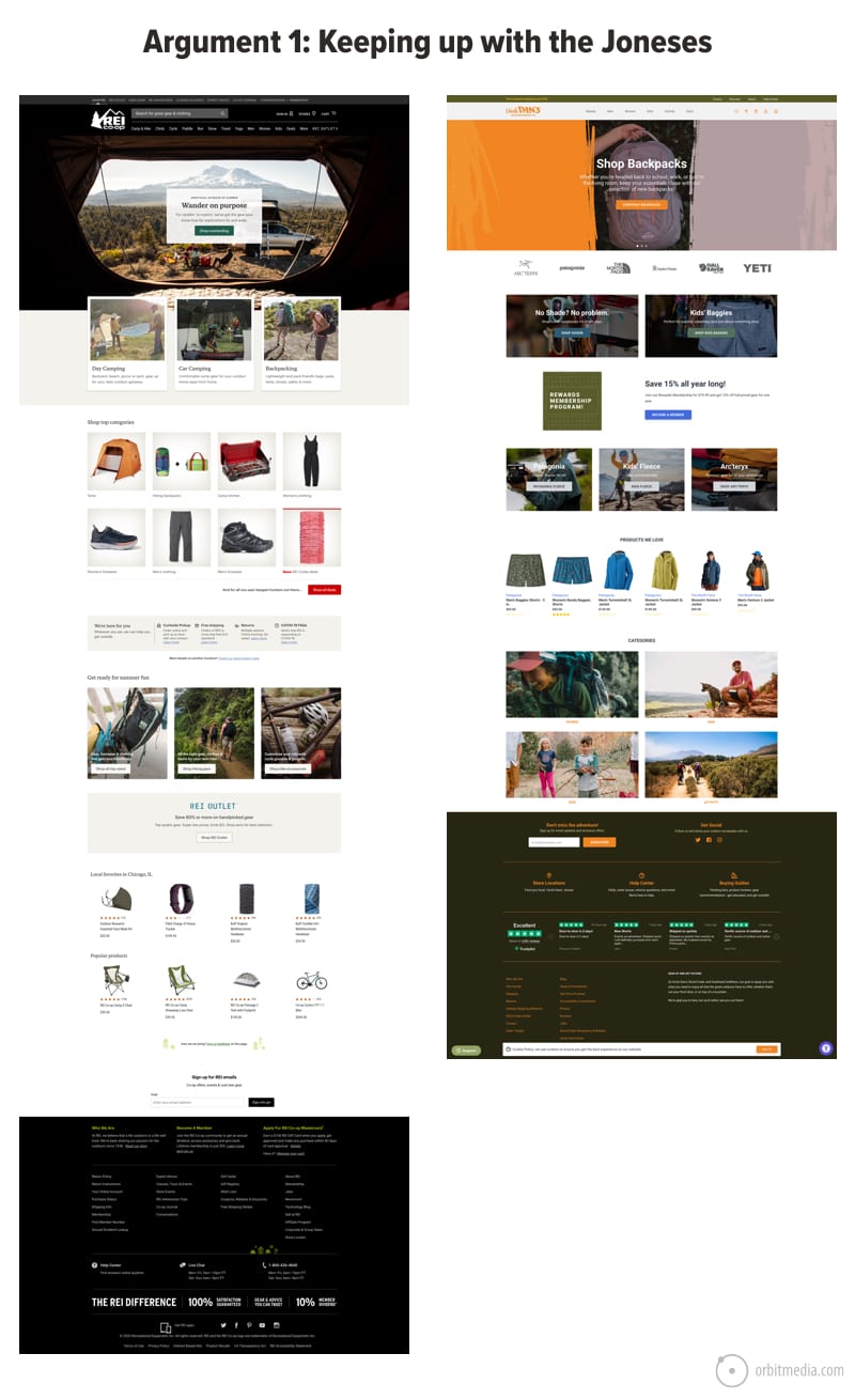
Show your websites side-by-side. One thing we’ve learned in doing over a thousand websites is that people not in marketing or sales rarely look at their own site. So leadership might not even recognize how outdated you are. That’s why we need to show them how the websites of your competition are better. Some things to point out include:
- User experience
- Clear and direct navigation
- A coherent content and design plan
- No use of clunky stock photos
- Better-presented thought leadership
- A better overall look
These are just immediate impressions that you can show without diving too far into data. But these immediate impressions matter. After all, they are what your visitor sees first. Your visitor will have the same impression. And if they have agnostic about you vs. your competitor, they’ll immediately be drawn to the better site.
Visitor impression is your next best argument.
Argument 2: Feedback from your audience
Another good way to get attention from leadership is to bring up your customers and potential clients. Oh yes, our clients, they’ll say, grinning and glowing. Our clients are wise and wonderful! We should listen to them.
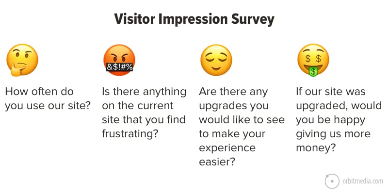
The visitor’s impression is an extremely useful tool of persuasion. Take a survey of some of your trusted customers. It doesn’t have to be more than few questions.

It’s possible that you can leave out the fourth question. That’s because 1) it’s weird, and 2) it will be answered pretty implicitly. If they have trouble reaching people, engaging with new platforms, or understanding how some of your services fit in with others, chances are, so do other visitors. So do potential clients. And there’s no way to make more money if visitors don’t even know how to give it to you.
Argument 3: Get feedback from your team
Leadership might not use your site a lot. In fact, a lot of people on your team don’t use the site. But a lot of people do, and there are ways in which it is holding them back.
Sales: When they give a contact their card, the contact goes to the site. When they mention your company at a conference, people go to the site.
Frankly, the sales team shouldn’t be embarrassed to send someone to your site. The site has to reflect what the actual offerings are. Ideally, a sales team would feel comfortable sending potential customers to specific pages tailored exactly to their needs. An updated site can make that happen.
Marketing: This is the team that probably uses the site the most. If it is hard to use, that makes it harder to promote thought leadership or special offerings.
It makes it harder to talk about what is new and exciting. It makes it impossible to use your #1 most important marketing tool to, well, market.
Customer Service: Customer Service might not always be using the site, but they are on the frontlines of the customer experience.
And some of the most crucial aspects to the experience is frustration with the site along with mismatched expectations. If your site is promising something and the customer is getting something else, that’s a problem.
Getting direct feedback from these groups is one of the most valuable tools of persuasion you have. After all, they are saying “this website is making it hard for me to do my job, which if done right brings in more revenue.”
Argument 4: Flatlining data
Now it’s time for your ace-in-the-hole…numbers. Analytics. Data. Charts.
Neither you nor your leadership team needs to be experts in Google Analytics to understand your basics. The most important things to show are that 1) people aren’t coming to your site and 2) on the off-chance that they do come do your site, they leave pretty quickly without engaging or taking action.

To do this you need to set up Google Analytics. It’s not that hard, and don’t worry: someone from our team can walk you through it.
What are some of the most important Google Analytics metrics you want to present?
- Total traffic
- Aggregate bounce rate
- Aggregate conversion rate
- Time on Page
These are quick, easy to understand, and important. Again, our team can walk you through all of these. There are also a lot of ways to improve these numbers through better UX, a cohesive content strategy, adherence to best practices, conversion optimization, and more.
There are piecemeal ways to get it done, but if you already need a new site, then these piecemeal methods aren’t worth it. You’re not rearranging deck chairs on the Titanic, exactly. You’re more opening the door to a crumbling building.
Dramatic image? That’s fine. That’s the closing argument.
Argument 5: Don’t be the last to get it done
Ask yourself these questions:
- What happens if we’re the last people in our field to upgrade?
- What happens if we look bad?
- Will we lose customers?
- Will potential partners come to our site and decide that we’re outdated?
- Will people in the media looking for experts go somewhere else, thinking that we’re not worth presenting as thought leaders?
Fear might be the mind-killer, but it is also a great motivator. After all, the whole point is to promote yourself to people who want to use your services, whether you are a huge multinational enterprise or a small nonprofit organization. Having a website that makes that job harder should make leadership afraid.
But it should do more than make them afraid. It should make them inspired.
Concluding argument: Get a website as great as you
All of these arguments boil down to one thing: your site no longer serves your needs. It doesn’t serve your business goals. It doesn’t serve your marketing requirements. It doesn’t tell your story. And it doesn’t reflect who you are.
You’re exciting. You’re interesting. You have something amazing to offer.
A website is a tool, and it’s an investment. It can get the job done, whatever that job may be. It can bring in traffic and create new clients. It can attract investors and donors. It can promote you as a thought leader. It can, and should, be a reflection of your offerings, your culture and your values.
It’s a big haul, yes. But when you work with a team that understands your goals and knows how to deliver, it’s nothing to be afraid of. It’s something to make happen.
The post How To Get Leadership to Buy Into a New Website appeared first on Orbit Media Studios.
from Orbit Media Studios https://www.orbitmedia.com/blog/how-to-get-leadership-to-buy-into-a-new-website/
via IFTTT
from
https://sarahbarnett0.wordpress.com/2020/08/03/how-to-get-leadership-to-buy-into-a-new-website/
No comments:
Post a Comment