If marketing is about knowing your audience and having empathy, then digital marketing is about data-driven empathy.
Be a data-driven marketer. You hear that a lot. But what does this really mean? What is data-driven marketing? What data drives us? How do we apply it? There must be more to it than running reports and reviewing dashboards.
Data-driven marketing uses qualitative and quantitative data to make marketing decisions through research, hypothesis formation, prioritization and testing.
Here are seven charts showing the process for using data to make digital marketing decisions.
I’m getting some help on this one from my old friend, Brian Massey. Brian is famous for two things: wearing a labcoat and conversion optimization. He’s taught thousands how to make better marketing decisions through data and analysis.
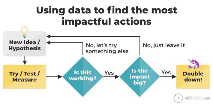
Ideas are great, but a hypothesis can be tested and confirmed. The difference is data.
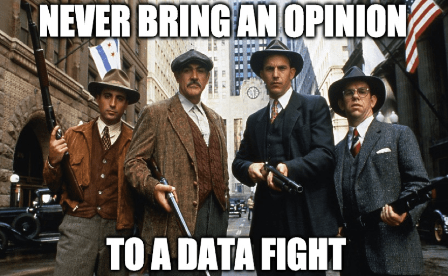
This approach shows the difference between opinion-driven decisions, and data-driven decisions. This brings us to our second chart which shows that all inputs for marketing decisions fit into a hierarchy of data quality.

Let’s break them down in detail:
1. Opinion / Personal Preference
You are a dataset of one.
It’s hard to recognize your own biases and set aside your own opinion. But that’s the first job of the digital marketer. Because we aren’t the target market. When there is no data, opinion drives the decision-making process. But who’s opinion wins? In meetings, it’s usually the most dominant (or loudest) person, which is often a manager or executive.
- Opinion vs. Opinion: the highest-paid opinion wins
- Opinion vs. Data: the data wins
- Data vs. Data: the best data wins
Beware the “hippo” (the Highest Paid Person’s Opinion). The best way to fight hippos is with data, or with an offer to gather data through testing and experimentation.
 |
Brian Massey, Conversion Sciences“Think about it this way: if you are the only one making decisions, that’s data from one person, a sample size of 1. Making better decisions means finding larger samples to support your decisions. This is one role of a focus group.” |
2. Industry Best Practices
Best practices are certainly better than opinion.
You can find best practices all over the internet, and of course, this blog is filled with them. [1][2][3] But the availability of this information triggers a dangerous bias for decision makers.
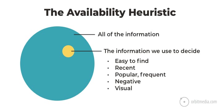
Shortcuts can be risky, and that’s exactly what best practices are. They are rules-of-thumb. They’re useful because they make decision making faster and easier. That’s good.
But marketing best practices are general to an industry, a platform or channel. Your audience is specific. Your website, your content and your audience all interact in unique ways, so the general advice of a best practice may not work at all.
Beyond the chance of missing the mark, there’s that other problem with best practices: sameness.
The entire point of best practices is to be safe by conforming to the norm, to not stand out. That can be a problem. If everything in your marketing conforms to best practices, your marketing is undifferentiated. It tastes like water.
When should you use or break with industry best practices?
- Use best practices to make sure you’re meeting basic’ needs (often design and UX)
- Break best practices when you need to surprise and delight (often content and copywriting)
And when in a marketing decision-making process, use best practices only if you have no access to data. Best practices make great hypotheses.
3. Marketing Analytics (Google Analytics, etc.)
Google Analytics is the big one, but this category includes any tool that measures audience behavior, including HotJar, Unbounce, your email service provider, your social metrics. Competitive analysis tools are also useful.
When there’s a lot on the line, you may not want to rely on a single tool. Smart marketers use more than one source of data whenever possible. Classic example: SEO agencies who report on clients’ rankings often combine several sources of data.
Marketing data is everywhere. In fact, some data is so available, you have to be careful of the availability heuristic again. It’s common to overvalue easy-to-find metrics and undervalue hard-to-find metrics.
We call this Julian’s Law in our breakdown of 37 content marketing metrics.
There is an inverse correlation between the visibility of a metric and its importance.
Two quick examples:
- Social metrics are easy to find / low impact
Follower size, likes, comments and share are so easy to see, they often skew marketing strategies. They don’t correlate much with business impact. - Conversion rates per channel are hard to find / high impact
Visitors from which traffic source are most likely to take action? Which actions do they take? This data is a bit harder to find, but it has a dramatic impact on marketing strategy.
 |
Brian Massey, guy wearing a labcoat“Analytics data is powerful because it is a large sample of actual customers on your website who don’t know they’re being tested and you don’t know who they are. It’s what we call “double blind” data. It’s delicious.” |
4. A/B Testing
When you test, you’re testing your pages with your content and your audience. The test is within the actual context of your marketing. This makes testing an excellent source of data.
The conversion optimizer uses tools such as Unbounce or Google Optimize to randomly show visitors two versions of a page. The version that triggers the desired action (usually click through or conversion) for the most visitors wins.
This is a very powerful and inexpensive way to test a hypothesis and discover the truth, because it isolates variables. But it only works if you have sufficient traffic to the page, which isn’t always the case. Not “big data” but “some data.”
 |
Justin Rondeau, DIGITAL MARKETER“Marketing is all about numbers, not feelings. The closer your decisions are to the hard number, the better. Though, I don’t believe A/B testing is the holy grail of data…in fact there are a lot of variables to consider and most companies don’t have enough volume to actually get useful data. And bad data is ALWAYS WORSE THAN no data.” |
Data Quality, Tools and Tactics
Let’s recap the problem with opinions and the value of data. The main differences are in sample size, sample quality and the age of the data.
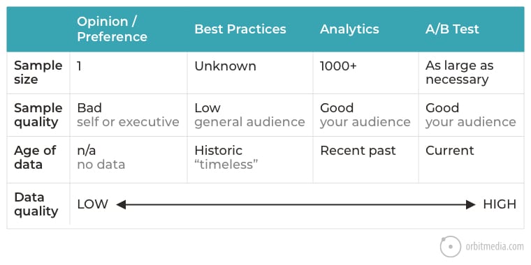
There are two main ways to get better data: improve the sample size or improve the sample quality. This brings us to the methods for data collection. There are many.
Here is a simplified version of Christian Rohrer’s famous chart of user research methods. It fits each method into a matrix: behavioral or attitudinal, qualitative or quantitative.
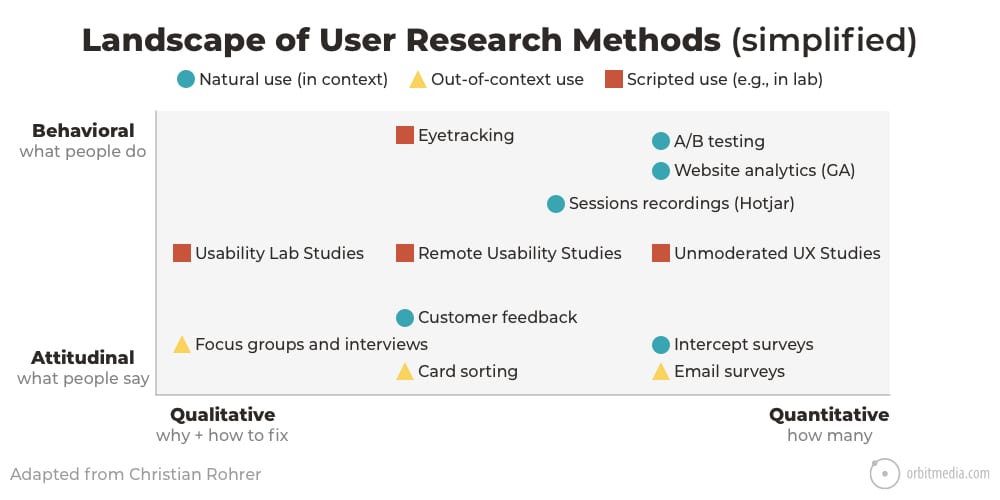
There is a tool for each method.
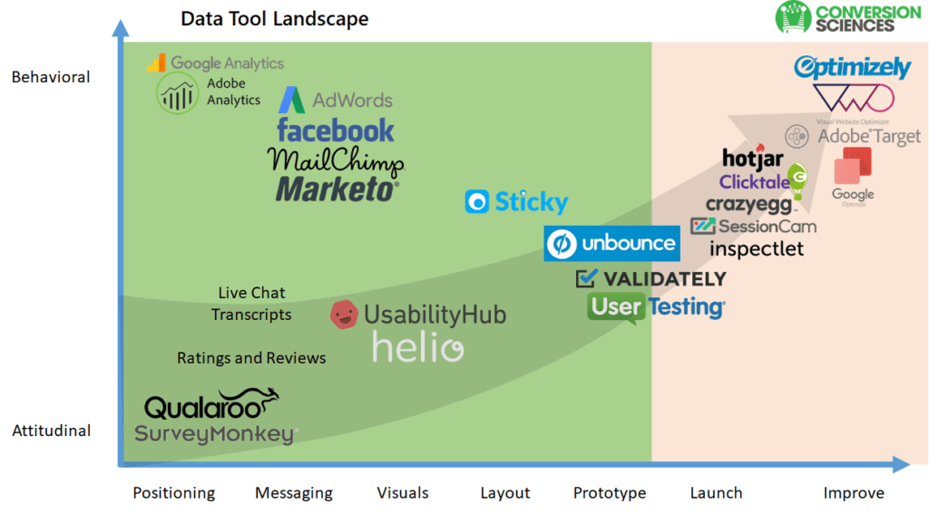
Brian Massey has another chart for us, showing where these tools fall within a similar matrix. I love this because it aligns with the web design process. Some tools are great for pre-launch research. Others are great for post-launch measurement.
Our general approach at Orbit is to start in the bottom left (interviews) and move toward the top right (website analytics and testing).
Ok, so we all want to use data-driven marketing strategies.
- We’re resisting the temptation of opinion.
- We’re gathering high-quality data.
- We have a list of possible improvements we can make to our websites and marketing.
What’s next? We need to prioritize all of these possible marketing actions.
How to capture and prioritize your marketing hypotheses
Brian suggests using a system to capture and score ideas against four separate criteria: proof, impact, level of effort and visits affected.
Here’s the framework:
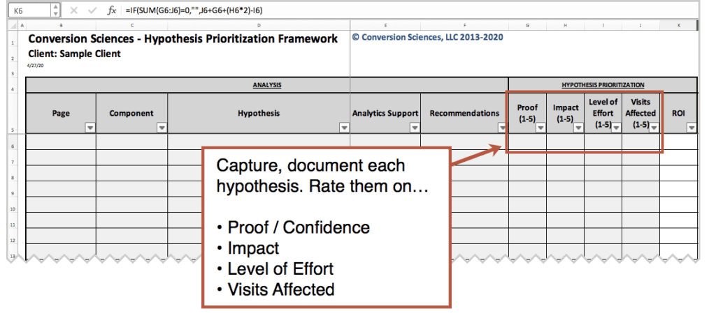
The formula in the ROI column is calculated from the scores you applied to the four criteria, but it gives extra weight to likely impact. Each hypothesis is scored on a 0-20 scale.
ROI = Visits Affected + Proof + (Impact x 2) – Level of Effort
This is a powerful marketing planning tool. You may download it here. It’s gated and 100% worth it.
Let’s take a closer look at each of Brian’s criteria. We’ve added examples with footnotes to help you get to our best advice for each related topic.
1. Proof / Confidence
Do we have evidence to support our hypothesis? A hypothesis is basically an educated guess. But how educated is this one? Is there any evidence that this change solves a problem or captures an opportunity?
- Low Proof Example: “I don’t like scrolling so let’s shorten our pages.”
- High Proof Example: “Let’s add content to pages with low time-on-page and high exit rate.”
2. Possible Impact
If the change works, will it make a big difference to the business? Does it help up high or down low in the funnel? The lower in the funnel, the higher the likely impact to conversion rates.
- Low Impact Example: “Let’s add internal links to our top blog posts.” [4]
- High Impact Example: “Let’s rewrite calls to action on our top service pages.”
3. Level of Effort / Cost / Ease
Does this require the help of a programmer or designer? Or can it be done in our content management system? Some changes take days and dollars. Others cost nothing and can be done with one hand while eating lunch.
- Low Effort Example: “Let’s change the sender name on our newsletter” [5]
- High Effort Example: “Let’s shoot videos for our social media posts” [6]
4. Visits Affected
This affects both the scope of the improvement (lots of people or just a few) and the speed at which you’ll get insights. Changes to pages with low traffic means waiting a while to get enough data to have confidence. Changes to top pages or global UX elements (like headers) gets you more data faster.
- Low Visibility Example: “Let’s try updating the navigation labels” [7]
- High Visibility Example: “Let’s remove all of the old, out-of-date posts from our blog” [8]
This brings us to our final chart, which shows the thinking in:

Source: AB Testing Framework, Conversion Sciences
Building a culture of data and testing
If you’ve ever been in a meeting with me, you may have heard me say this.
“I promise not to state my opinion. If I give you my personal opinion, call me out for it.”
I am asking the people around me to hold me accountable for data-driven decision making.
Marketing teams with this mentality sound a bit different in meetings. They use sciency words a lot:
- Hypothesis
- Evidence
- Metrics, KPIs
- Bias
- “I am a dataset of one”
- Let’s test it
Eventually, the tone of meetings evolves and a culture of data-driven marketing emerges. Marketing becomes more empathetic to the target audience. Here are some ideas for building up your immune system to opinion-driven marketing.
“I really like it when…”
If anyone in a meeting uses themselves as an example, you can honor the suggestion without derailing higher priority hypotheses. Use your hypothesis prioritization spreadsheet.
Part of the magic of this tool is stakeholder (and hippo) management. Anytime anyone makes a suggestion, however crazy, random or fun, the response becomes “Great! Let’s add it to our list.”
Voila! You’re having a better meeting.
“It can’t hurt…”
You may hear this in meetings. You may even say this in meetings. The idea is that the level of effort is so low, the action should proceed. The problem with this thinking is that if the other criteria aren’t met, it’s unlikely to help.
You can do things that “don’t hurt” every day, but unless you do things that actually drive results, you’ll never see the impact in the data.
Be skeptical when asked to do things that can’t hurt.
The whistle and the bell
Imagine highlighting the importance of data by putting a whistle and a bell on the conference table.
- Blow the whistle if anyone makes a suggestion based on personal opinion
- Ring the bell if anyone makes a suggestion based on evidence
I’ve never actually done this. I’d look like a total jerk in front of my clients and team if I acted like some kind of marketing referee, blowing whistles during meetings. But my mental whistle is always at the ready.
Footnotes:
[2] How to Improve Conversion Rates
[3] Website Footer Design Best Practices
[4] Internal Linking Strategies for SEO and Conversions
[5] How to Maximize Email Open Rates
[6] How to Make Solid Social Media Videos
[7] Website Navigation: 7 Design Tips and Warnings
[8] Delete Old Content: 11 Experts on Content Pruning and SEO
The post Data-Driven Empathy: 7 Charts That Show How to Make Smart Marketing Decisions appeared first on Orbit Media Studios.
from Orbit Media Studios https://www.orbitmedia.com/blog/data-driven-marketing-decisions/
via IFTTT
from
https://sarahbarnett0.wordpress.com/2020/04/29/data-driven-empathy-7-charts-that-show-how-to-make-smart-marketing-decisions/
No comments:
Post a Comment